Showing posts with label spatial experience. Show all posts

Thursday, March 4, 2010

SE: Kansas City Auto Show.

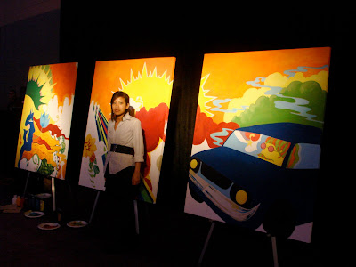
The KC Auto Show had all three components: poetic, practical and persuasive. One of the poetic parts was definitely my friend Jessica's mural because of its content and the connotations it brings. It seemed to allow viewers to use their imagination a lot more than other poetic pieces, which makes them interact with the piece longer.

The projection at the 100 years Dealer's Association party was definitely practical because it told you what the party was about and gave you information about when the Association was founded. The auto show also had various pamphlets and stands that told you what you are about to buy and how much it costs. They were also persuasive because each car dealer/brand wanted you to think that they are the best in the auto show.

The most persuasive component of the show, in my opinion, was the freedom to get into any car you like and pretend like you own it. Since cars are the main focus of the auto show, being able to see whether or not you like its features is a key element. Of course you can't take a $300.000 on a little test drive around town, but for many people the interior is a deciding aspect.
There were other persuasive elements such as models giving you bags with a logo on it, men talking about the features etc. A Ford robot attracted a huge crowd by pointing fingers at you, telling you to come up to him and then waving you goodbye.


A red Toyota bag was not a part of the Auto show identity and did not persuade me to buy a Toyota (maybe because I have one), but it tells me what I can do to reuse("Donate your old computer!), reduce ("Go paperless!") and recycle (paper, glass, cardboard). Since it can be carried around and gives information about what Toyota is trying to be about it is also practical. The bag being red probably has something to do with persuasion.

Thursday, February 25, 2010

SE: Barricade.


This is model of a hypothetical barricade for the Bank of China tower in Hong Kong. A few concepts found its way into the final design. The architect's (I.M. Pei) tried to reference bamboo sticks in the overall look of the building. Bamboo is a symbol of growth and renovation. The design of the barricade incorporates the geometric shapes of the building and such colors as green, yellow and orange. These colors connote growth and renewal and support this idea.The triangles "grow" directly from the ground making the entire structure look more organic. The second idea is transparency. The bank of China is a complex system that needs to be clear and transparent. I took this term literally. The triangles are layered to create an illusion. The shapes also connote stock charts. The third idea is to facilitate user interaction with the barricade by creating tunnels that both add dimension to the structure and make the user see something different.
The type is layered on different triangles but forms one line. I used a sans serif to support the idea of modernism that was a big influence on the building's architect.


Friday, January 29, 2010

Spatial Experience (SE): Buildings I like.

I am currently looking for a building I can make a model of. I now realize i am attracted to simplicity and angularity combined with natural materials like wood or twine. I also think the location of the building is extremely important. The lighting plays a big part of the general appeal of the building. Ever since I was a kid I was attracted to small confined spaces bordering with big areas that seem to be full of freedom. Below are a few examples of the styles I like.