Showing posts with label retro modern. Show all posts

Friday, April 3, 2009

T4: Logo development


I played around with my type to create the logo "Retro Modern". I want the logo to be flexible and have variations so that you can mix and match and have more visual appeal to the system. I'm thinking of using retro colors and have a pretty big color palette.

Thursday, March 26, 2009

Monday, March 23, 2009

T4: Retro Modern.

Timeline

Type Conference Names:
Square Fluidity
Retro Geometry
Square but sensitive
Textured Modern
Retro Modern
Geometric Retro
Back to Square
Dare to Square
Square the Retro
(Retro)2
Illustrative Geometry

Final Name and Information
Retro Modern
Typographic Conference
May 20-23, 2009
______ Hall
Kansas City, MO 64111
www.retromodern09.com

Description
Remember that movie theater you used to go to in the good old 60's? Remember the glowing lights, curvy type and the happy memory of youth? The memory became all dusty and got that worn texture that is now so popular in typography. In the age of high-tech and data overflow more and more people are attracted to the laid-back hospitality of the past. Retro Modern '09 is going to explore the popular tendencies in modern graphic design that involve a retro, nostalgic feel. It is also going to look at the way modern shapes and technology are used to recreate the retro. The conference will also include a lecture by Scott Hansen as well as two demos and presentations.

Biography
Scott Hansen is a designer and musician from San Francisco, who has years of experience in freelance design. He is currently an independent designer, who created his own shop, clothing line and blog, that are encompassed on his website ISO50.
Scott divides his works in two categories: design and illustration. His experience of working for Adobe can be seen in some of his works. Many of Scott's designs are stylized and digitally refined.
Here's what he says about his influences: "Obviously I do a good deal of looking back when it comes to inspiration. I feel the design that blossomed from the Bauhaus movement and came of age in the 1960’s was the Zenith of an art form whose importance would fade away as Television, and later the Internet, took over the reigns of visual communication thus effectively transforming the medium."
Scott Hansen is lecturing on May 21st in _____at 9 pm. Join Scott for his lecture about geometric type and the grunge movement on May 20th 2009!

Concept
I'm thinking that my overall theme should be a mix of geometry and handmade-type. The geometric type could be used for posters and big catchy areas of type while small captions can be handwritten. I'm still not sure about the typeface choice... I see the colors being organic and faded, so that the geometry and high-tech feel could stand out more. Recycled materials seem to be a good option. Overall, I'm thinking a of a system that would not have a traditional laserjet printer aesthetic, but something more personal and textured. I want people to take the artifacts home and not throw them away as soon as they get to the first trash can.

Thought this was interesting and relevant.

Tuesday, March 3, 2009

Sunday, February 22, 2009

T4: Experimentation with texture.

I like the idea of using analog media for this, but I'm not very satisfied with the way the letterforms look now. Even the cleanest sketches seem messy. So now I'm off to see what else i can get...


Sunday, February 15, 2009

T4: Lucky accidents and ideas


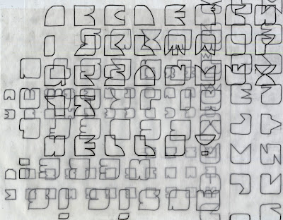
I accidentally did this and it seems to be a cool effect. My original idea was to make the patterns organized like a pattern or an abstract composition, but the layering affect is a lot more dynamic. Color could make it even more interesting.

My ideas so far:
-Digital type layered with the hand-rendered type.
-Digital type filled in with water-based media like water color.
-3D photographed
-Digital outlines layered on top of photographed objects or textures

Saturday, February 14, 2009

T4: Explorations.


I used the grid on the cutting matt as a base for my type. In the one-on-one critique, Tyler said that the typeface above looks "ice-creamy". I think it does look very soft and I think I'm going to develop that feel a little bit more.


The typeface above is a little bit more geometric than the first one, but I tried to combine both hard edges and round shapes. I think that combination has a lot of potential. I'm not sure if I want to develop it further, simply because I don't enjoy working on it too much.
Directly below is my first development of my initial idea (see post from February 9) and the first digital translation of it. I like the simplicity of it that is close to being illegible. At the same time I'm a little bit concerned about this. Does it have to be legible? In the first exploration all the circles were the same, soI decided to vary the size of the circles to differentiate the letters (see b and c).

I love how clean it looks in the digital version...

The more I work on these typeface, the more structure I try to maintain. I think it is important to be consistent in making something so geometric and reliant on form. My next step will be a creation of patterns and improvement or destruction of legibility. I will also start to play with colors and textures.

.... oh, and I just realized that Scott Hansen's work in the last post was obviously my inspiration!

Monday, February 9, 2009

T4: Questions.

- How can I use different media and still achieve the grunge effect?
-How can I make grunge less dependent on technology?
-How can I use the grid and structure in grunge?
-What defines grunge?
-How can geometry become a significant part of grunge?
-How can I combine type and image? Can I do it without making it look too busy?
-Can the extended letterforms become the image?


I tried some things with the grid and tried to simplify the type as much as possible. This lead me to the following question:
"How can I make the type the key part of the work without the viewer understanding that right away? How can I fool the viewer into believing that type equals image?"